Chapter 7 Margins, Padding and Borders
Historically Opera has been best at supporting CSS, recommended you add Opera to your home computer - looks to still be true.
CSS3 Web-site generators will often generate specific code for each browser. Specific code not that important,
most browsers support the CSS3 standard.
Inspect Element will display box model with colors; Varies between inspect, all inspects have a layout, or box model diagonal panel..
| Browser |
Content |
Padding |
Border |
Margin |
| DW Inpsect "WebKit Rendering Engine" |
blue |
green |
yellow |
orange |
| Chrome "Uses an enhanced webkit version" |
blue |
green |
yellow |
orange |
| FireFox "firebug is weak here" |
blue |
purple |
gray |
yellow |
Chrome's inspect box model, displayed under styles tab
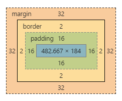
Margin Distance from border to next element
border physical border
padding distance from content to border
content, Padding: distance from padding to border, border three arguments, margin: distance from border to next element.
background-color color thru the outer edge of the border
Can apply values to padding, border, and margin, to all four side, top right, left and right;
border-top: medium solid blue;
border-bottom: medium dashed black;
border-left: medium dotted black;
border-right: medium dotted black;
margin-right: 20px;
padding-top: 3em;
margin-left: 10%; use 10% of the bounding box, the bounding box (aka container) is the <body> in this case.
Short Hand: margin top right bottom left; Clockwise from top;
margin: 0 10px 10px 20px;
padding: 10px 5px 5px 10px;
can specify all four sides at once,
margin: 0; padding: 10px;
| Note Table with margin: auto; /* centers it */; width: 50%; 90% is inline style |
| margin |
distance border next content |
| border |
border: thickness style color; border 20px dotted red; |
| padding |
distance from content to border |
Top element has a margin-bottom: 3em;
This Element has margin-top: 2em; Vertical top and bottom margins collapse into the larger of the two.
Horizontal elements sum up the margins.
Indent
This div block has margin:2em; padding:5em; background-color:#ddd.
but notice that the first line above has a negative margin-left:-1em;, so it uses up the padding of
its parent bouding box, (aka container)
Extra Extra Extra
Raise Sardines in you Hot Tub - you can eat sardines like trout, they don't have to be canned. They are fast growing and very nutritious. This paragraph has a margin-top:-2em; so it overlaps the top h2 header block
- display: block | inline | inline-block | list-style; Display property is the display type of the element.
- <p>, <h1>, <h2> and <div> are block level elements. We hae a new line break before and after the element
- <span>, <em>, <strong> are inline line elements, no new line breaks.
Adding Borders page 194
border: width style color; Styles...
border: 2px blue solid;
border: 2px blue dashed;
border: 2px blue dotted;
border: 4px blue double;
border: 8px groove;
border: 4px inset
border: 4px outset
border: 12px ridge
border: none
border: inherit
ridge, groove, inset and outset need more pixels for proper shading
border: 2px solid black;
border-bottom: 4px dashed #333;
padding:1em;
or set each one...
border-top: 2px solid black;
border-left: 2px solid black;
border-right: 2px solid black;
border-bottom: 4px dashed #333;
border: 2px dashed;
border-color: green yellow red blue;
border-radius: top-left top-right bottom-right bottom-left;
border-radius: 5px; each corner
border-radius: 0 20px 0 0;
border-radius:40%;
border-radius: 10px / 20px;
small x large y
border radius
box-shadow: [inset] horizontal-offset vertical-offset [blur [spread [color]]]; same as text-shadow, except for optional inset and spread
box-shadow: 4px 6px 8px rgba( 0, 0, 0, 0.75); block is point 0,0 same as text-shadow
box-shadow: 0px 0px 8px rgba( 0, 0, 0, 0.75)
box-shadow: -4px -6px 8px 2px rgba( 0, 0,0,0.5), 8px 6px 12px rgpa(0,0,0,0.5)
box-shadow: inset 0 0 8px 2px rgba( 0, 0, 0, 0.75);
box-shadow: 10px 5px 8px magenta,
/* Magenta lower right */
-5px -10px 10px skyblue;
/*kyblue upper left corner*/
its
text-shadow: xOffset yOffset blur color
box-shadow: [inset] xOffset yOffset blur spread color;
box-shadow just adds spread and inset
Determining height and width Page 204
1: This div block width:50%; margin:auto; width is based on the container, for this div it 50% of the body. Width is space allocated to content, Inside p tags have widths which are 20% of this div block
2: This paragraph is display: inline-block; margin:3px; width:20%; background-color:aqua; float:left; Note default block type for p is block, which causes newline break; img is inline.
3: This is upper right corner of previous block;
margin:3px; width:20%; background-color: aquamarine;
4: display: inline-block; margin:3px; width:25%; background-color: lavender; float:right;
5 - fifth block element; style="display: inline-block; margin:3px; width:20%; it will use the float right of the 4th element and move in between 3rd and 4th element
6: same as block 2, but float:right; height:10em; display:inline-block; margin:3px; width:20%; background-color:aqua; float:right; its best not to set height;
7: same as 3 but with
margin:3px; width:20%; background-color:aquamarine;
8: Default p tag will be a newline break after 7th element. Note absolute values for height, width, can cause overflow problems. overflow: visible | hidden | scroll; but never have two scroll bars.
box-sizing: default set width for content; box-sizing:content-box; but this
can cause problems we have padding, and/or border
These
divs are using box-sizing:border-box; width:50%; can set whole page * {box-sizing:border-box;} had to set this float:right;