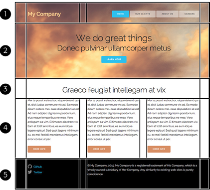
Structuring Your HTML Grids...
- Container (holds a set of data aka 1 or more rows )
- Rows has one or more columns
- Columns (12 Units and/or 12 Columns on Each Row)
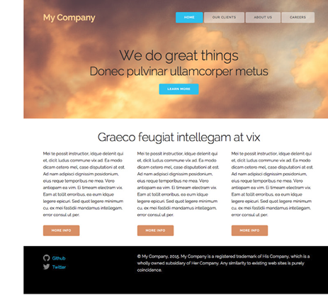
- Note above images is a div container with one row and three columns; Note the entire one page is often a single container.
Lightweight CSS Grid Systems (page 497)
Heavyweight CSS/JavaScript frameworks, include JavaScript code replacing jQueryUI.
All fluid grid systems above are RWD, A more advance method is display:flex, which is covered in next chapter.
Note these systems expect the same sized content. You may have to add CSS to set heights. As of Spring/2019 none of these system recognize
high resolution aka retina displays.
- RWD Grid Systems
- Collapses Columns window width less than 550
- http://getskeleton.com uses normalize.css
- Load Files in skeleton folder (usually by version)
- They have sample index.html file (open save as testing.html)
- Loads normalize.css, skeleton.css and Loads Google Raleway WOFF font
Raleway is sans-serif header font
- Add div container page may have single container, containers hold rows
- Add div row inside cotainer
- Add 12 unit grid columns to each row (columns need to add up to twelve)
Can have just a a single row with no columns
- Add content inside or div columns
- Need to format content on own, skeleton moves the skeleton
place your custom css styles as the third css style sheet
Creating Full Width Sections
div.container is never full wdith of browser window you have two options...
- Set background color/image of body tag
- Can place div="container" inside another div block
- Can use ID inside of the class="row image" set image class properties
Example columnNames2.html
- Use css box-shadow: x_ offset y_offset blur [spread] color
- Use css background-sizing: x width y-width [cover | conains ] property
Styling Buttons page 506 - buttons.html
- Skeleton is mainly a Grid System
- Has styling for tag <button> or class .button you also have .button.primaryButton
- Also include form element styling
Skeleton Mobile First
- initial design is for Mobile phones
- add media queries when additional width is available (more spacing, columns, etc)
- Typical Width Media Queries...
- @meida ( min-width: 400px ) { .... } Rule only applies if screen has width of at least 400px
- @media( min-width: 550px) { ... } Rules for phablet all widths 550px or larger
- @media( min-width: 750px) { .. } larger than tablet
- @media( min-width: 1000px) { .. } desktop
- @media( min-width: 1200px) { } HD
- Use Chromes device tools, DW live view or Web Developer for testing
Tutorial Page 509 Adding a Grid
- Open the file 16/index.html, save outside of data folder in folder 16
- Add before </head> - also copy over the three css files to new folder
<link rel="stylesheet" href="css/normalize.css">
<link rel="stylesheet" href="css/skeleton.css">
<link rel="stylesheet" href="css/custom.css">
- Below comment <!-- top section --> add.
<div class="container">
</div>
- Create two rows inside <div class="container" >
<div class="row">
</div>
<div class="row">
</div>
</div>
- In first rwo add 2 units
<div class="four columns">
<p class="logo">My Company</p>
</div>
<div class="eight columns nav">
</div>
- Open the file 01-nav.html add code to nav
<div class="eight columns nav">
<a href="#">Home</a>
<a href="#">Our Clients</a>
<a href="#">About Us</a>
<a href="#">Careers</a>
</div>
- Add class="button" attrbute to each link
<a class="button" href="#">Home</a>
<a class="button"href="#">Our Clients</a>
<a class="button" href="#">About Us</a>
<a class="button" href="#">Careers</a>
- Add class="button-primary" to first tag
<a class="button button-primary" href="#">Home</a>
- Open 02-action.html copy data to second row
<h1>We do great things</h1>
<h2>Donec pulvinar ullamcorper metus</h2>
<a href="#" class="button button-primary">Learn More</a>
- Add class="row action" to second row, will format .action later on
<div class="row action">
- Save index.html in new folder and preview

- Open 03-info.html Copy content below <!-- info section -->
- Make first div class="container"
- Make next two children div class="row"
- Aadd class="four columns" to each div inside second row (3 columns)
<div class="row">
<div class="four columns">
<p>Mei te possit instructior…</p>
- Open 04-footer.html Copy the HTML paste content belwo <!-- footer -->
- save index.hmlt and preview the file
Adding Style
- Open related file custom.css
- after /* Mobile first queries */ add...
/* applies to ALL widths */
.container {
background-color: pink;
}
- Preview index.html all three containers are now pink
- Add new div to header at <!-- top section --> add
<div class="section header">
before <div class="container">
- Before <!-- info section --> add close </div>
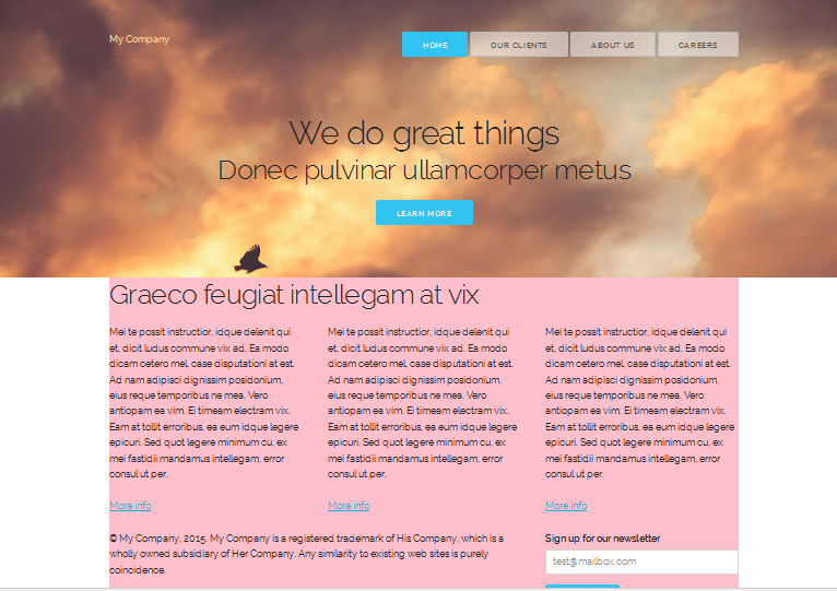
- Add customer .header image
copy imgs frolder from data/16 to working folder add css code to custom.css
.header {
padding: 50px 0 70px 0;
background-image: url(../imgs/header.jpg);
background-size: cover;
}
- Just below .header section add...
.logo {
font-weight: 600;
color: rgb(255, 209, 143);
}
- Add three more styles after .logo style
.nav {
text-align: right;
}
.button {
background-color: rgba(255,255,255,.5);
}
.button:hover {
background-color: rgba(255,255,255,.3);
}
- Add three more styles
.action {
text-align: center;
padding-top: 75px;
}
.action h1 {
margin: 0;
}
.action h2 {
margin: 0 0 20px 0;
}
- NIB - make .header .container transparent ,
.header .container {
background-color: transparent;
}
- Save and preview index.html
The Mobile Design page 518