Chapter 10 CSS Transforms, Transition and Animations
Reloading Linked Files (i.e., JavaScript, CSS external files)
- F5 or normal Reload reloads the current HTML page (not the linked external CSS/JavaScript files)
- Chrome: With Inspect aka Web Developer (reload icon has more options)
- Shift-F5 Right^Click Hard Reload Menu Item (reload linked files),
- Ctrl F5 empty cache and hard reload, to empty cashe (can clear cache in settings)
- Web Developer "Application Tab" is the browser Application (cache access)
Class Site Designs...
- Rollover Alpha Liugi Scollo
- Rotate Links Daryl Jacobs (need to update to transform: translate( x, y );
Historically Opera has been best at supporting CSS, add Opera to my home computer - looks to still be true.
CSS3 Web-site generators will often generate specific code for each browser.
Transitions Historically
- dynamic GIFs
- Flash (but not supported mobile phones) WebASM?
- JavaScript - steep learning curve
transform : [ rotate | scale(x,y) | skew ]
- rotate - transform: rotate( 10deg);
- scale - transform: scale( X, Y );
- translate
- skewing (slanting) along veritical or horizonal axis
transform-style: flat|preserve-3d|initial|inherit; (flast is default)
transform:rotate( n° )
1 transform:rotate(0deg)
2 Rotate 45° CCW (same as CW) note transforms don't affect element around them so this will overlap previous div block
3 transform:rotate(10deg); CW
4 transform:rotate(90deg); CW
5 transform:rotate(180deg); CW
6 transform:rotate(720deg); CW Rotations
transform:scale(x,y)
transform:scale(1); computed size
transform:scale(0.5); 1/2 size
transform:scale(2);
transform:scale(0.5,2); 1/2 size x double size Y
scale( 1.5, 0.5 );
scale( -1 ); flip elment upside down left to right
scale( -1, 1 ); flip elment vertical axis only
scale(-2, -1 ); double x and flip
transform:translate( x, y );
1 Book errata page 326 need transform property before translate
2 Beware of transformed elements, the original location prior translation is used for rendering
3 This is a translate(200px, 150px); but notice its original location is now blank, and it overlaps next content
4 They can overlap other page content, translate is normally used with buttons
5 Rotate up transform: translateY( -5em ); Overlap?
6 Rotate up transform: translate( 0, -5em ); reminder its translate( x, y );
transform: skew( x axis translate by x °, y axis translation y ° gives a 3D out of page translation )
1 transform: skew( 45deg, 0 );
2 transform: skew( 0, 45deg );
3 transform: skew( 25deg, 10deg );
Mutiple transformation, transform: [ rotate | translate | scale | skew ] standard space separated
1 transform: rotate(45deg) scale(2);
2 transform: skew(45deg,0deg) scale(.5) translate(400px,500px) rotate(90deg);
transform: scale(0.8) rotate(10deg) translateX(91px);
textbook stie
transform-origin: x% y%; axis of rotation default center of element
1 default origin; transform-origin: 0% 0%; transform: rotate(45deg);
2 transform-origin: left top; transform: rotate(45deg);
3 transform-origin: right bottom; transform: rotate(45deg); same as 100% 100%
4 transform-origin: 0% 100%; transform: rotate(45deg);
Transitions animation from CSS property set to nex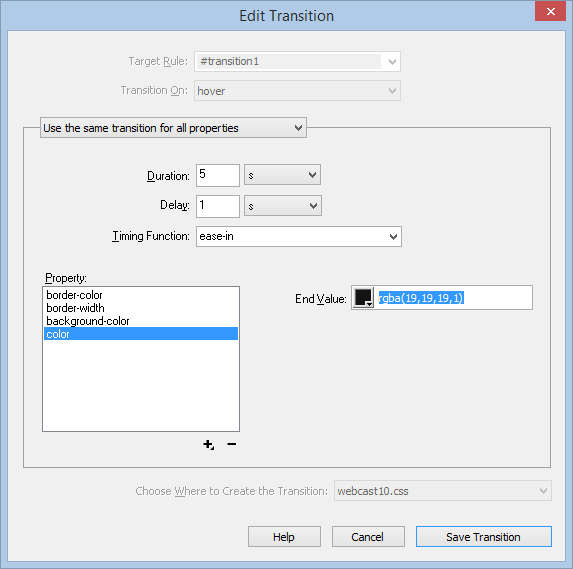 t CSS property set
DW Window --> CSS Transition shows current transitions; clicking edit bring edit Transition
- Before (target rule) (#transition1)
- set transition property, duration, delay, easing with before rule
- trigger - transition on "action"
- #transition1: hover will have after target
style rules
transtion : properties duration timing-function delay
- DW does this by default, they also add browser prefix #transition1
- transition: all 1s ease-in .5s;
- transition: all 1s;
- transition:background-color 1s;
- transition: color 1s, background-color 1s, border-color .5s 1s;
Animated Properties by w3c but let DW do it, orange to blue on hover
transition-property: color, background-color, border-color;
transition-duration: 100ms, .2.75s, 5s
Animations
- css transition go from one CSS set to one other CSS set
- CSS animation can have multiple key frames
- Key Frame has specific CSS properties
- transition from one key frame to the next using, standard delay, duration, timing-function
- DW will list animation under CSS Designer More Cateogory button.
- Use internal FireFox inspect element
- This chapter we use high level tools, css3maker.com
- Good Interfaces don't exist yet,
- Difficult to get them to work
- Can be annoying to viewers, stick with subtle transitions
@keyframes growAndGlow {
from {
background-color: yellow;
}
50% {
transform: scale(1.5);
background-color: blue;
}
to {
transform: scale(3);
background-color: red;
}
}
.animation1 {
animation-name: growAndGlow;
animation-delay: 3s;
animation-duration: 5s;}
will change color grow once, starting at 3seconds and ending 5 seconds later.
Creating an Animation
  first Create @keyframes fadeIn {
    from { opacity: 0; }
    to { opacity: 1; }
  }
- Use animation-property use with selector .announcement {
animation-name: fadeIn;
animation-delay: 10s;
animation-duration: 5s;
animation-iteration-count: 2; /*can set to infinite but this can get annoying */
}
animation name duration timing-function delay iteration-count direction fill-mode
Subtle Button effect is good
Chapter 10 Tutorial is on pages 349-355.